The concept
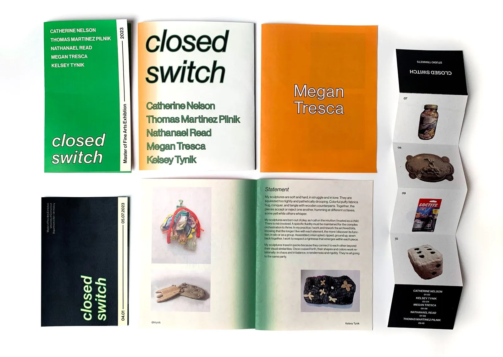
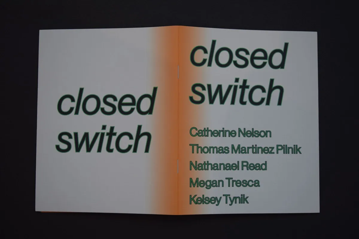
The concept came from the title — a closed switch completes a circuit. The cover runs a green-to-orange gradient that resolves into the orange used throughout the interior dividers.
Exhibition Book Identity & Layout
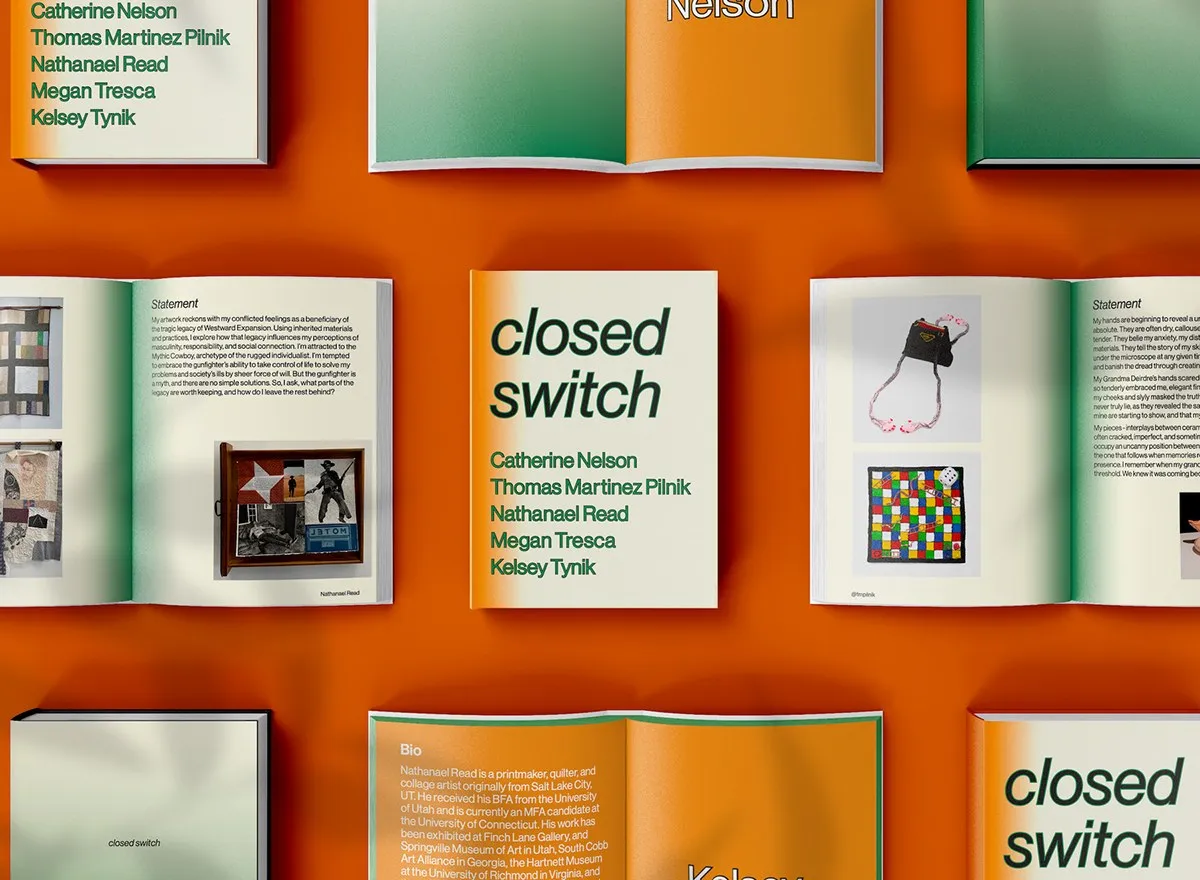
The concept came from the title — a closed switch completes a circuit. The cover runs a green-to-orange gradient that resolves into the orange used throughout the interior dividers.
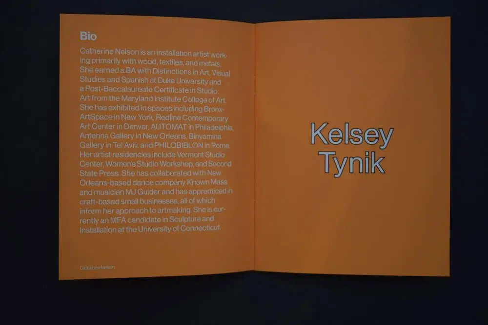
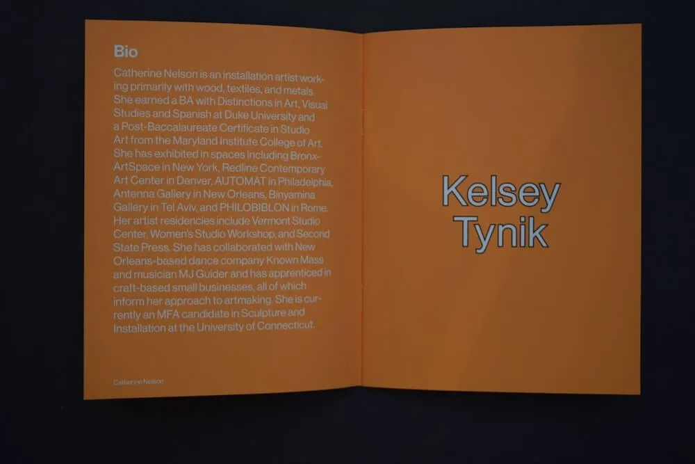
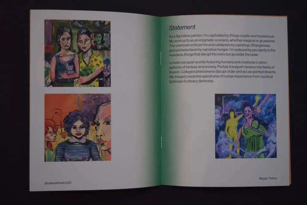
Each artist runs on the same two spreads: a full-bleed divider carrying bio and name, then plates on white with the statement facing. The structure repeats without variation, so the work is the only thing that changes between sections.
Execution ran across the broader team, so the system had to be specific enough to apply without me present. That requirement shaped the rules more than any stylistic decision.
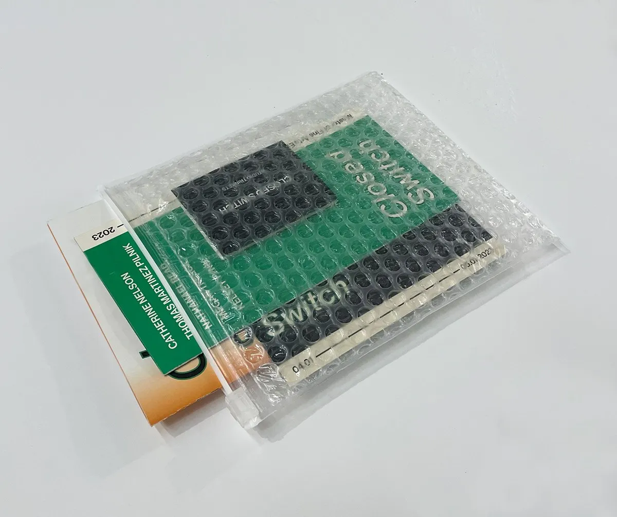
The publication shipped as a package in a clear bubble-wrap pouch. The green sleeve and the black exhibition card carried the exhibition information: title, artists, dates, making the show legible before the contents were opened. The package also held a zine and additional inserts produced by others, which the identity had to accommodate.