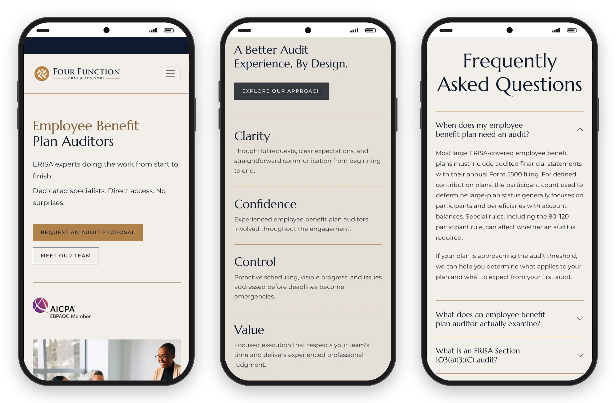
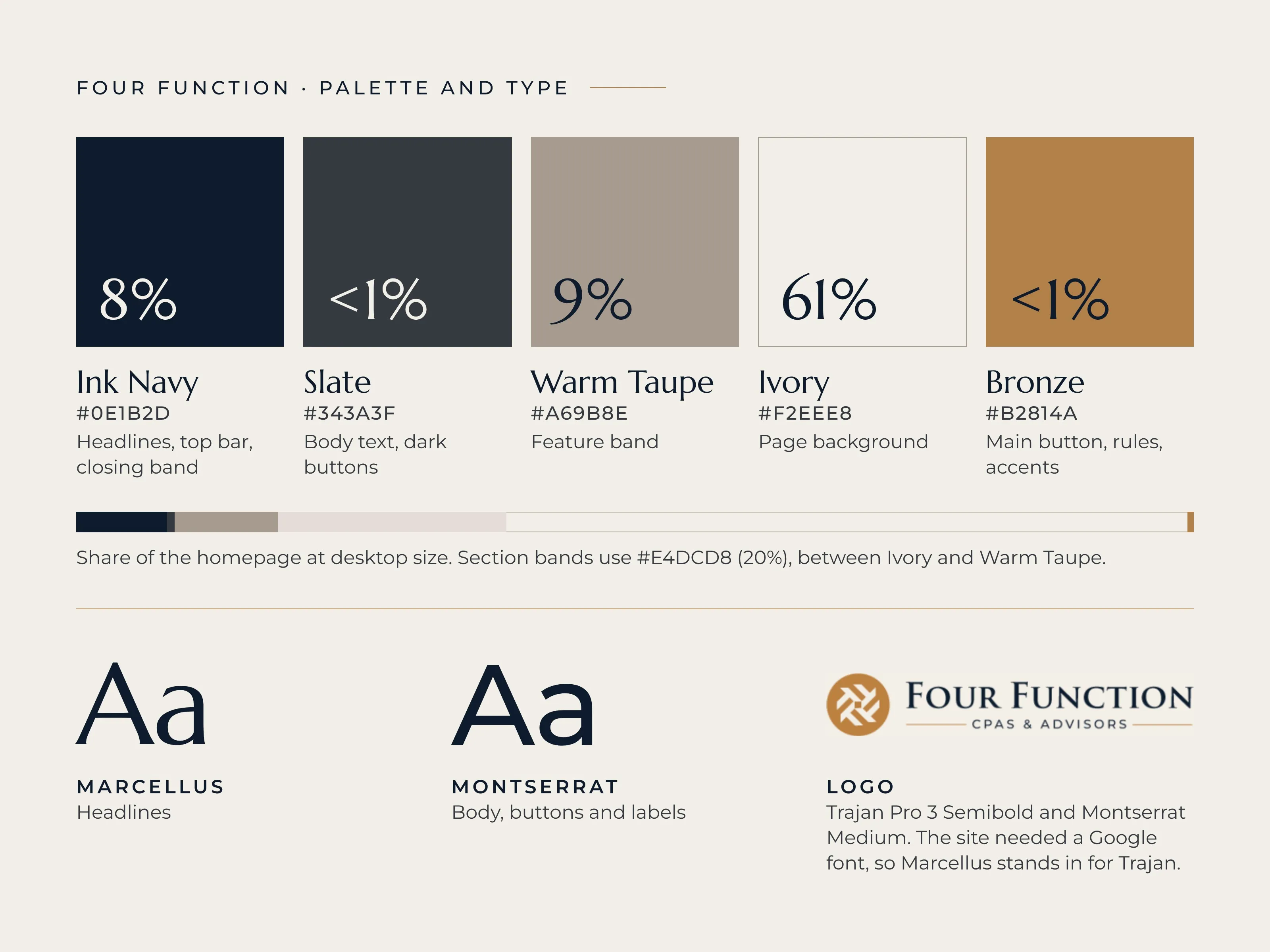
The look
Warm neutrals, a refined serif and generous space. I kept the page calm, so it feels high-end, not generic.
A custom website for an employee benefit plan audit firm

Warm neutrals, a refined serif and generous space. I kept the page calm, so it feels high-end, not generic.
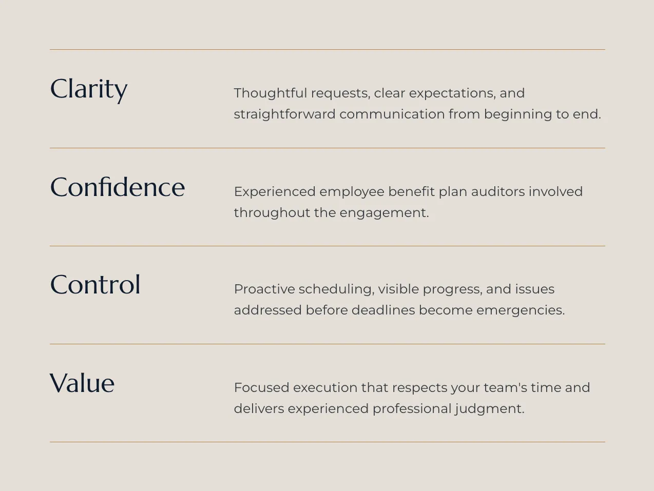
The firm’s four values, Clarity, Confidence, Control and Value, sit in one clean list. Each gets one short sentence, so the promise is easy to scan.
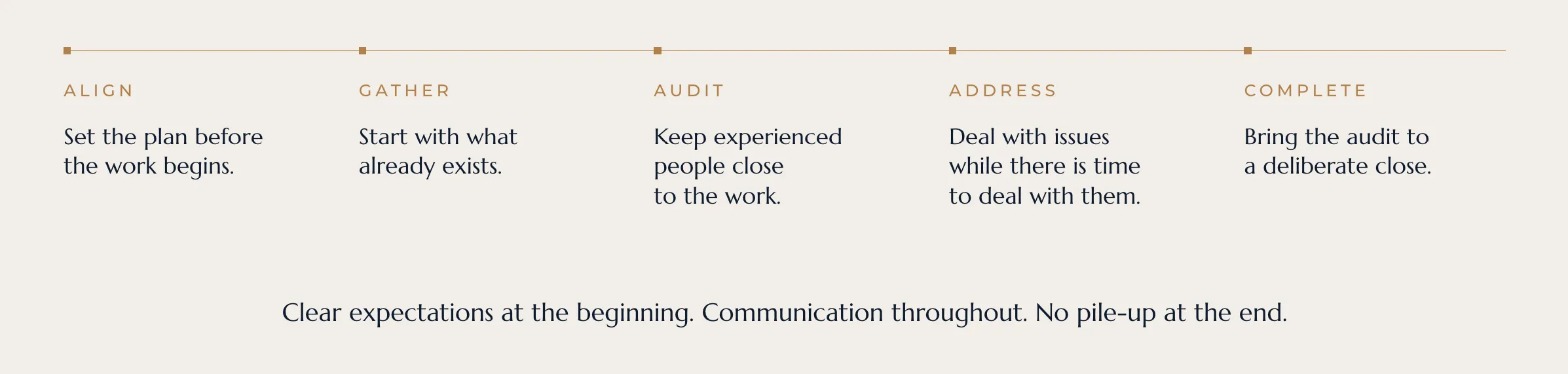
Five steps, Align, Gather, Audit, Address and Complete, laid out as a timeline. A client can see the whole audit before it starts.
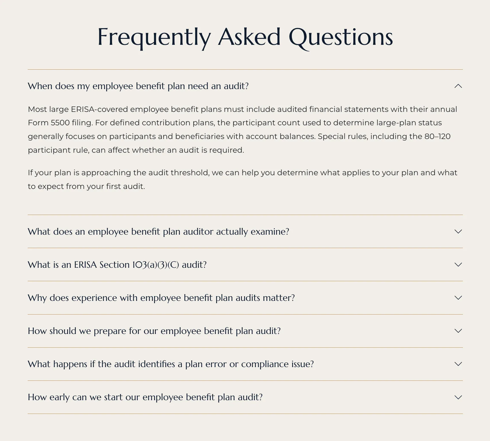
The FAQ sits near the end of the page in a short ruled list. Each answer opens in place, so the page stays short.
I built every section to work on a phone. The layout stacks in the same order, with the same type and colors.